GameOps Panel: V2 Redesign
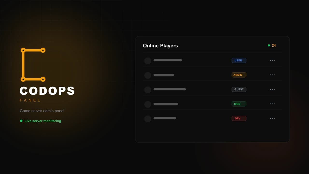
A full UI/UX redesign and rebrand of the CoD4 admin panel, built on one unified component system across every page.
Overview
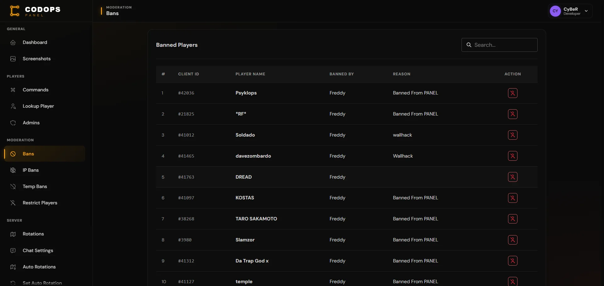
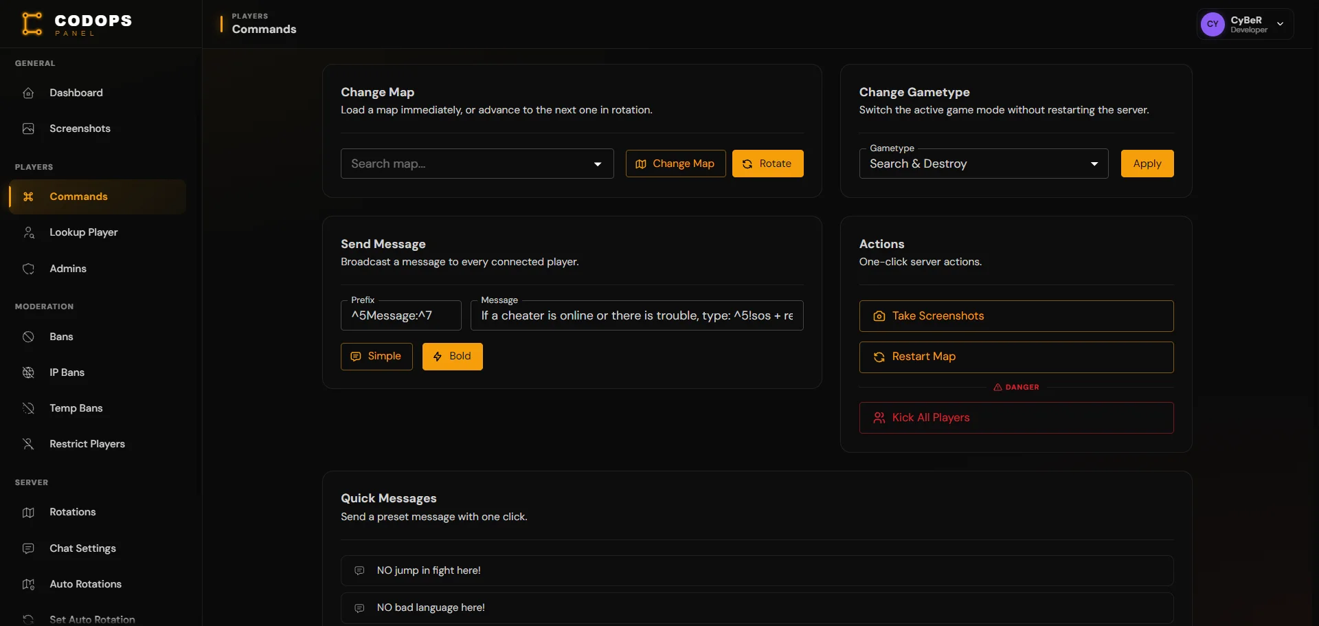
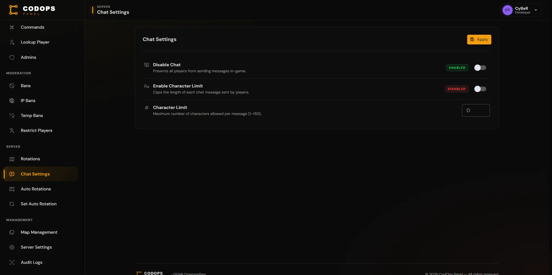
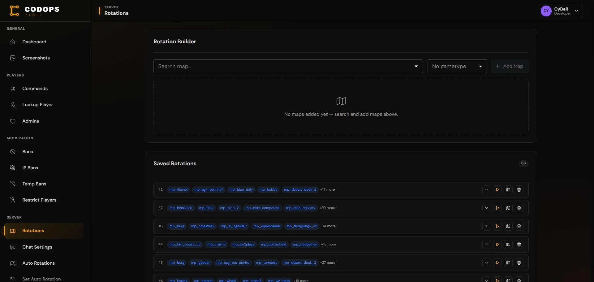
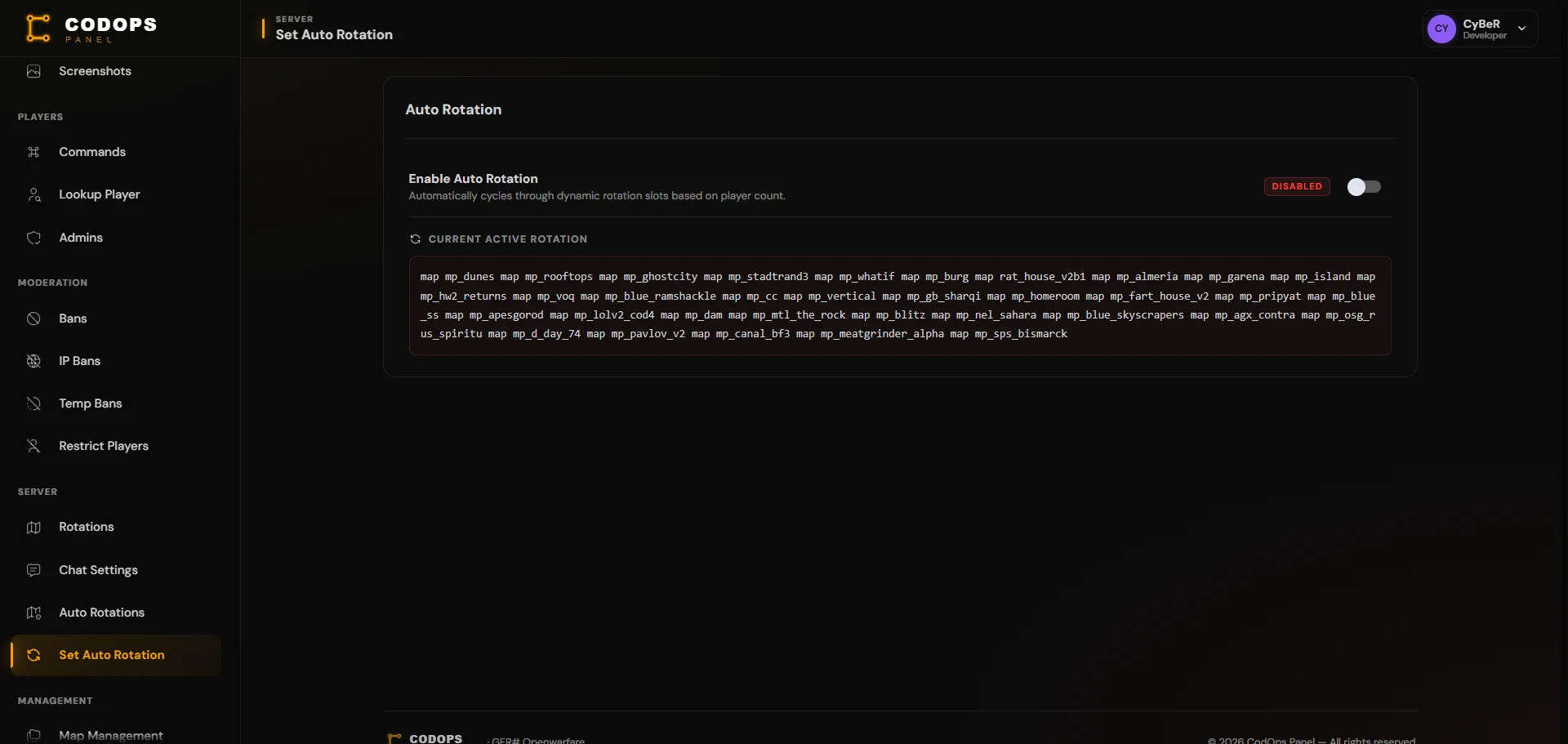
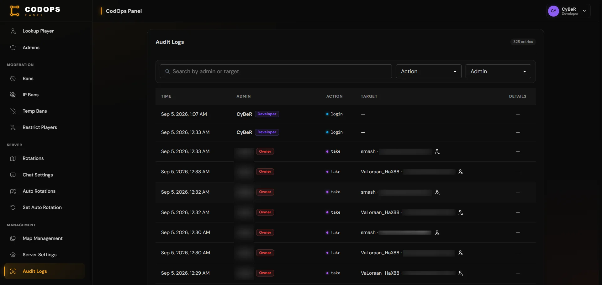
A ground-up visual and interaction redesign of the same CoD4/B3 admin panel, run as a parallel iteration alongside the live V1 codebase. Every screen (login, dashboard, sidebar, player profiles, audit logs, server settings) was rebuilt against a single shared design system instead of each page inventing its own look, and the whole product was rebranded from a generic placeholder identity to CodOps Panel with a deliberate amber-on-near-black palette.
How it came together
Challenge
The original panel had grown page by page, so five different pages had five different takes on the same idea: role badges, status toggles, and level tags each used their own one-off colors and chip styles, section headers ranged from plain text to decorative divider gimmicks, and structural chrome like the sidebar and header didn't share a background, border, or spacing language even though they sit right next to each other on screen. None of it was broken, but none of it read as one product either.
Solution
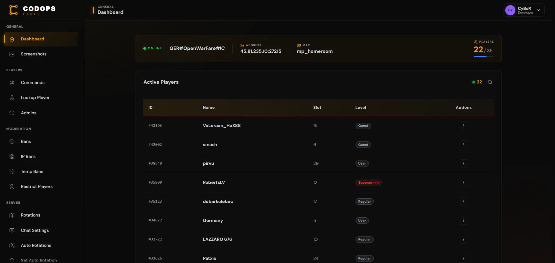
Extracted the repeated patterns into a small set of shared primitives (a translucent color-coded Pill for every status/role/level badge, a StatusSwitch for every on/off toggle, a unified BaseCard header) and rolled them out across the whole app so a role badge on the dashboard, the audit log, and a player's profile page all render identically. Unified the sidebar, header, and page background onto one shared ambient layer and one hairline border color instead of three independently-tuned surfaces. Rebuilt the login screen as a split branded/form layout, fixed real layout bugs along the way (a flexbox sizing bug that made sidebar items unreachable, a controlled-input warning from an unguarded API response), and finished with a full amber rebrand: new logo mark, favicon, and a systematic pass to keep the new brand color from colliding with existing semantic and role colors already used for meaning elsewhere in the app.
Outcome
The panel now reads as one designed product rather than a stack of independently-built pages, with a component system in place so the next new page inherits the same look for free instead of reinventing it.
Technical Stack
Tags
Visual Showcase
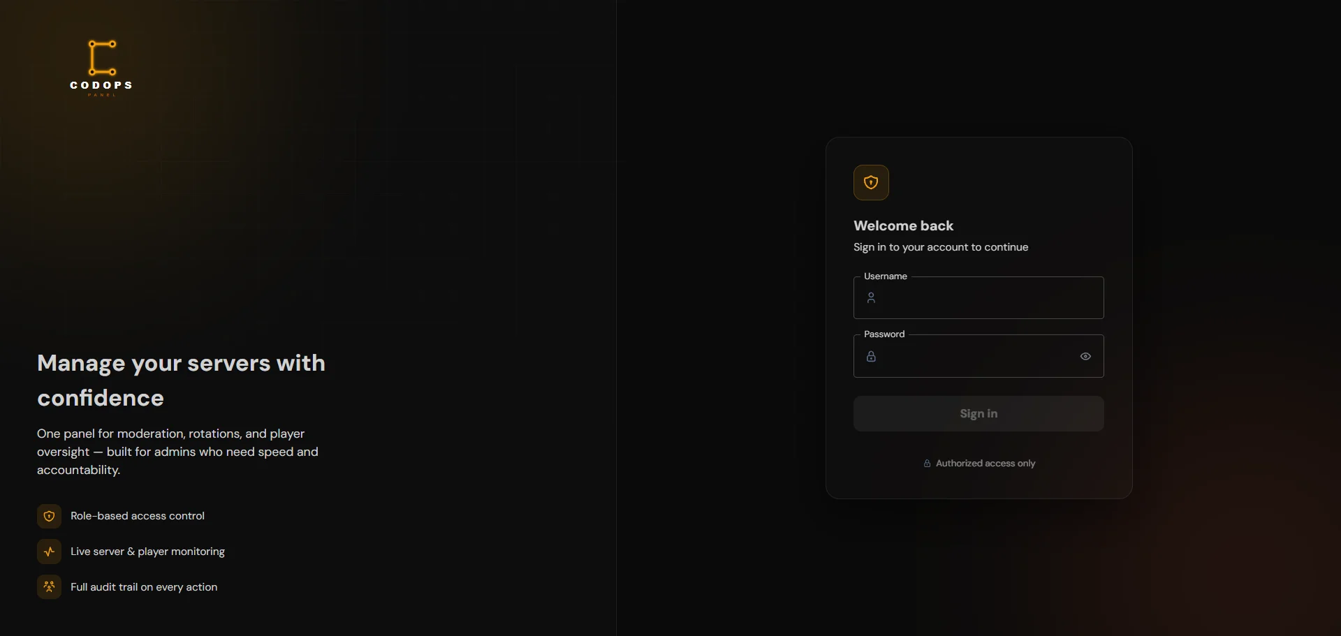
Redesigned Login
Split branded/form layout replacing the old plain centered card.
Key Features
Unified Component System
One Pill component for every role/status/level badge, one StatusSwitch for every toggle, one BaseCard header, replacing five pages' worth of one-off chip and divider styles.
Full Rebrand
New name, logo mark, favicon, and an amber-on-near-black palette applied consistently, including resolving collisions with existing role-color coding.
Cohesive Shell
Sidebar, header, and page background unified onto one shared ambient layer and border language instead of three independently-styled surfaces.
Redesigned Login
Split branded/form layout replacing a plain centered card, sharing the same grid-and-glow language as the rest of the app.
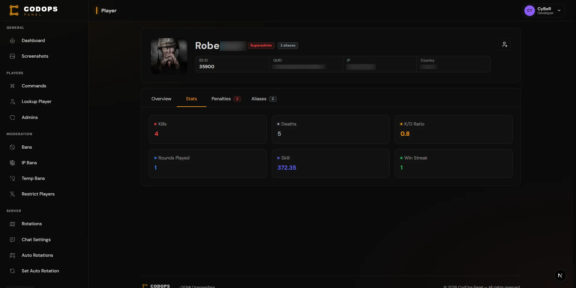
Player Profile Overhaul
Replaced an old-style modal and a wall of same-colored action buttons with proper dialogs, severity-graded button groups, and a compact metadata strip.
Real Bug Fixes Along the Way
Found and fixed a flexbox sizing bug that made sidebar items unreachable and a controlled-input warning caused by an unguarded API response.